Accumulated deposits
All of these surfaces accumulated various amounts of fat deposit, eventually leading us to wonder, how much of this stuff ends up inside us?
In one home, and perhaps from previous tenants that had occupied the place, we found fine fat particles high on the walls near the ceiling. We knew some of these particles were micro-sized, and how far they carried around the home was staggering.
It set us thinking. What’s happening with us? Does it sit in our lungs? Is it bad for us?
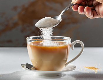
We always knew that too much sugar was bad, but we never stopped (or moderated) using it in stews, sauces and tea. For Peter, two spoonfuls in tea was normal in the seven or eight cups he drank daily.
“Of course, all this was happening while we raised our three children,” Peter says, “and today, I’m ashamed to say, we were more concerned about the potential stains that a glass of spilt Fanta could leave on the carpet than what the consumption of sugar-sweetened beverages was doing to our kids.”
“The fact is, both of us were blind to the impact that our definition of eating healthy had anything to do with scientific investigation on the subject and was severely influenced by shaky media articles and the weight loss bible as written by Jenny Craig.”
One of the ‘advantages’ of whole food plant-only eating is that you quickly become aware of what is happening (or not happening) within your body.
When you are accustomed to two spoonfuls
of sugar in your tea and then drop one, you
suddenly make an astounding discovery
– the tea tastes disgusting.
Strangely, though, if you persist, it tastes almost normal in about three weeks.
“Then I threw in an extra spoonful for old times’ sake,” Peter says, “and I nearly threw up. The same happened when we moved from full cream to light milk.”
At this point, it was still some time before ‘the big push,” but salt was probably the most awkward when we both think back on it, although Catherine would put her love for cheese on the same shelf.
The confusing thing about salt is that you know humans need it, but you’re never too sure how much and who measures their intake of it anyway. Cheese, you just eat and eat.
Of course, cheese contains plenty of salt and many other things, but it never dawned on us until after “the big push” that it also includes a lot of fat. With salt, well, most of the recipe books we read said that you need to “add salt for taste, so why hold back? When it came to food, moderation was never our strong suit.
By the time the children reached their early teenage years, all the family were heavily addicted to the taste of sugar, oil, salt and fat. Eating was moderated by income at different times, although by volume only, not quality. It never occurred to us that a whole new (and much less expensive) world of unadulterated good taste existed until something drastic happened.
The big push
In May 2014, Peter had a stroke. It was a TIA (trans ischemic attack) or mini-stroke, as it is often called, but it was a stroke nonetheless.
“Nothing makes you weigh up your options like a serious medical event,” Peter says, “but the fact was we were also left scratching our heads. Where did we go wrong? All the tests certainly proved that things were wrong, but how?”
Catherine was just as devasted.
“I always thought I was feeding all of us healthy food. I used recipes from Healthy Food Guide and other magazines, but they didn’t help. At the hospital, when the dieticians came to see us, I explained how meals were made up, and all they could say was that we should use less salt. In light of what I know now, it was laughable,” she said.
The next big push came about two weeks after Peter came home from hospital.
“My daughter Bridget, a staunched vegan, visited and suggested we watch Forks over Knives. We stopped eating red meat almost immediately, but it took us another three years to become fully plant-only eaters and still a little while longer to be completely WFPB (whole food plant-based) – no oil, no sugar, no salt.
“My only regret was that I initially held onto the idea that we could moderate (and change the blood tests) while still eating chicken and fish,” Peter says. “That never happened. I couldn’t ‘moderate’, perhaps because I was so addicted to the taste of saturated fat, I guess.”
Today, both of us are committed to a WFPB SOS (sugar, oil, salt) free diet. Today, we know that eating healthy and being happy about it involves far more than just the food itself. Reallly, it’s a whole new way of life. We call it Whole Food Living.


